Molina Healthcare is a health insurance company that offers affordable plan options to people across the US. The company takes a compassionate stance towards healthcare and prides itself in its philanthropic initiatives. The goal was to give the brand a much-needed refresh.
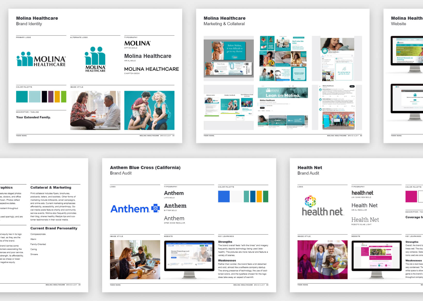
Internal and competitive audits were performed to assess the company’s current visual identity as well as the visual scope of other health insurance competitors. Materials examined included company logos, print collateral, and digital applications.
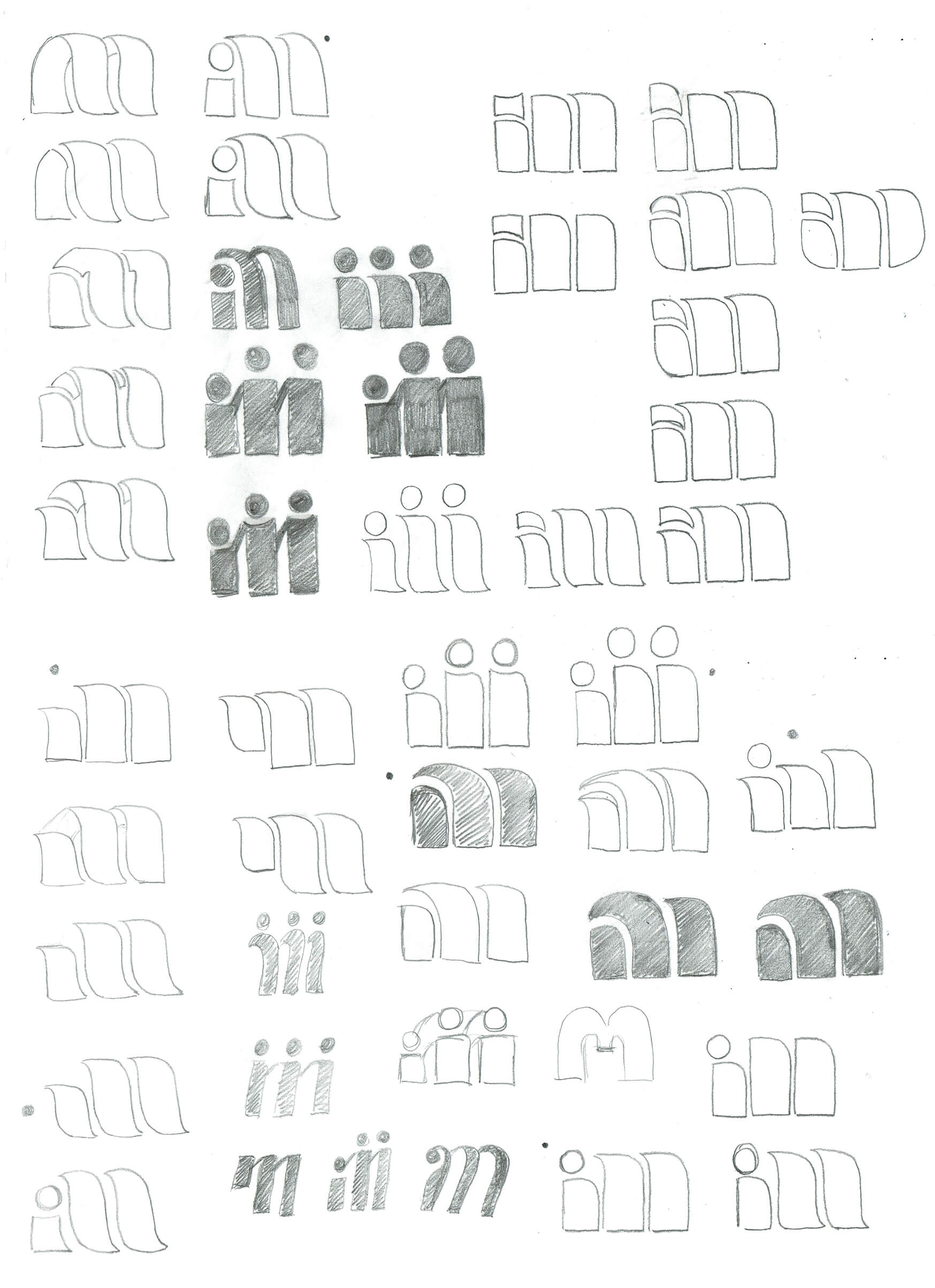
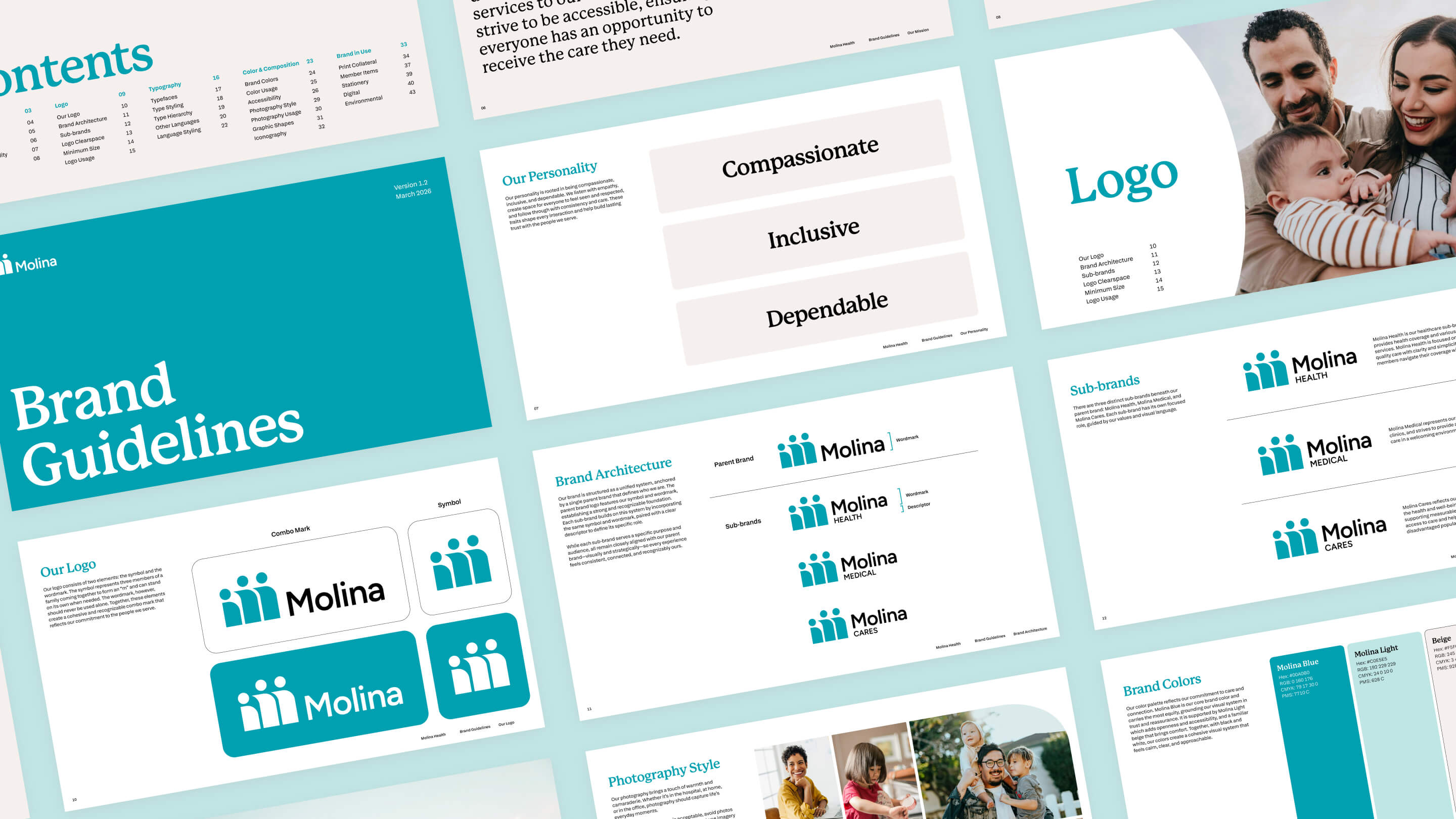
Different ways to evolve the logo were explored in sketches and in vector form. Ideas ranged from playing with the shape of the letter “M” to incorporating the concept of a family before ultimately deciding on cleaning up the current mark to preserve as much brand equity as possible.


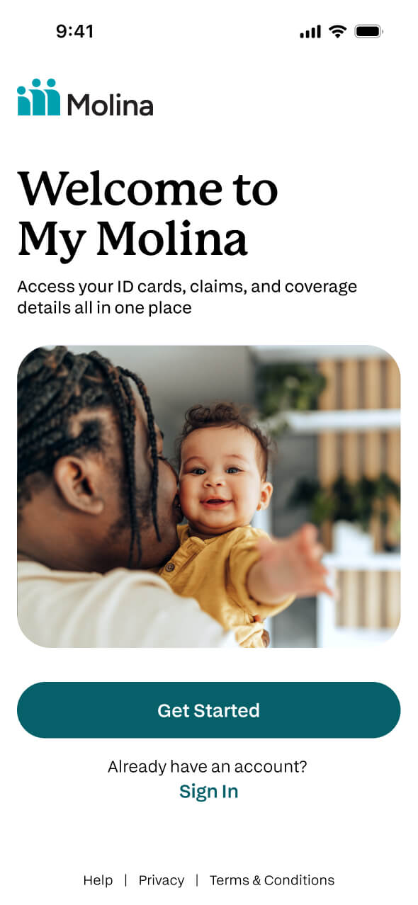
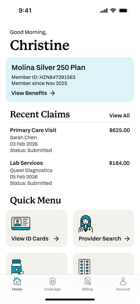
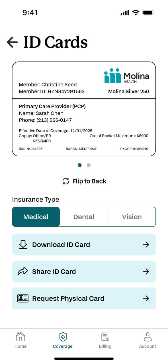
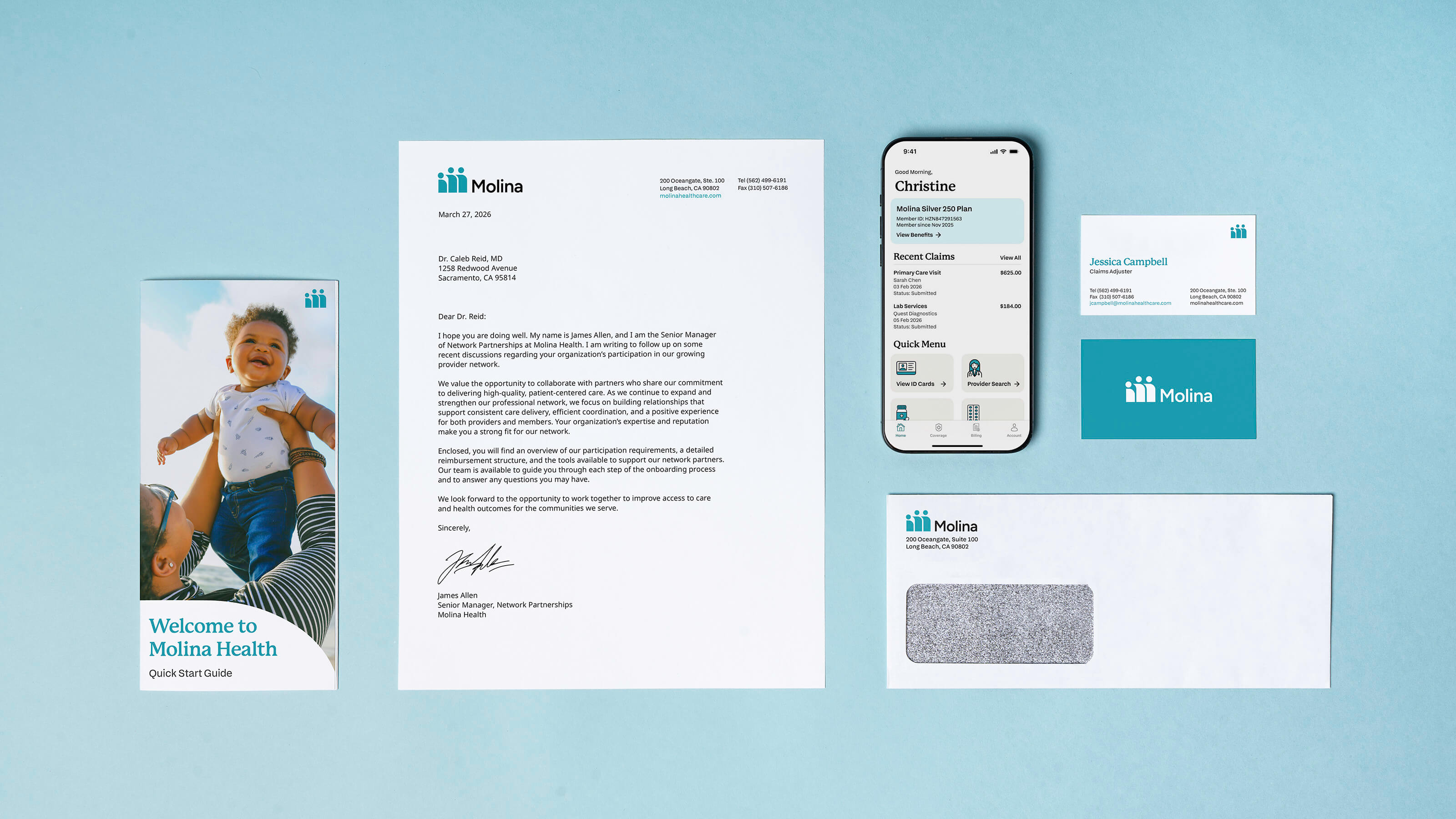
The new identity was applied to a quick start guide for new members as well as digitally on the company’s website and app. Photography, icons, and typefaces were updated to bring a modern touch while keeping the company’s existing tone of voice consistent. In particular, messaging was kept to be warm and welcoming.